Yorkville University
Info

Digital Art Direction — Web Design — Brand Storytelling
Client — Yorkville University
Art Direction, UX/UI — Michael Lipsett
Group Account Director — Caitlin Tang-Hurley
Producer — Kelsey Westbrook
Agency — Pound & Grain
Pound & Grain, 2024. Art Director, UX and Visual
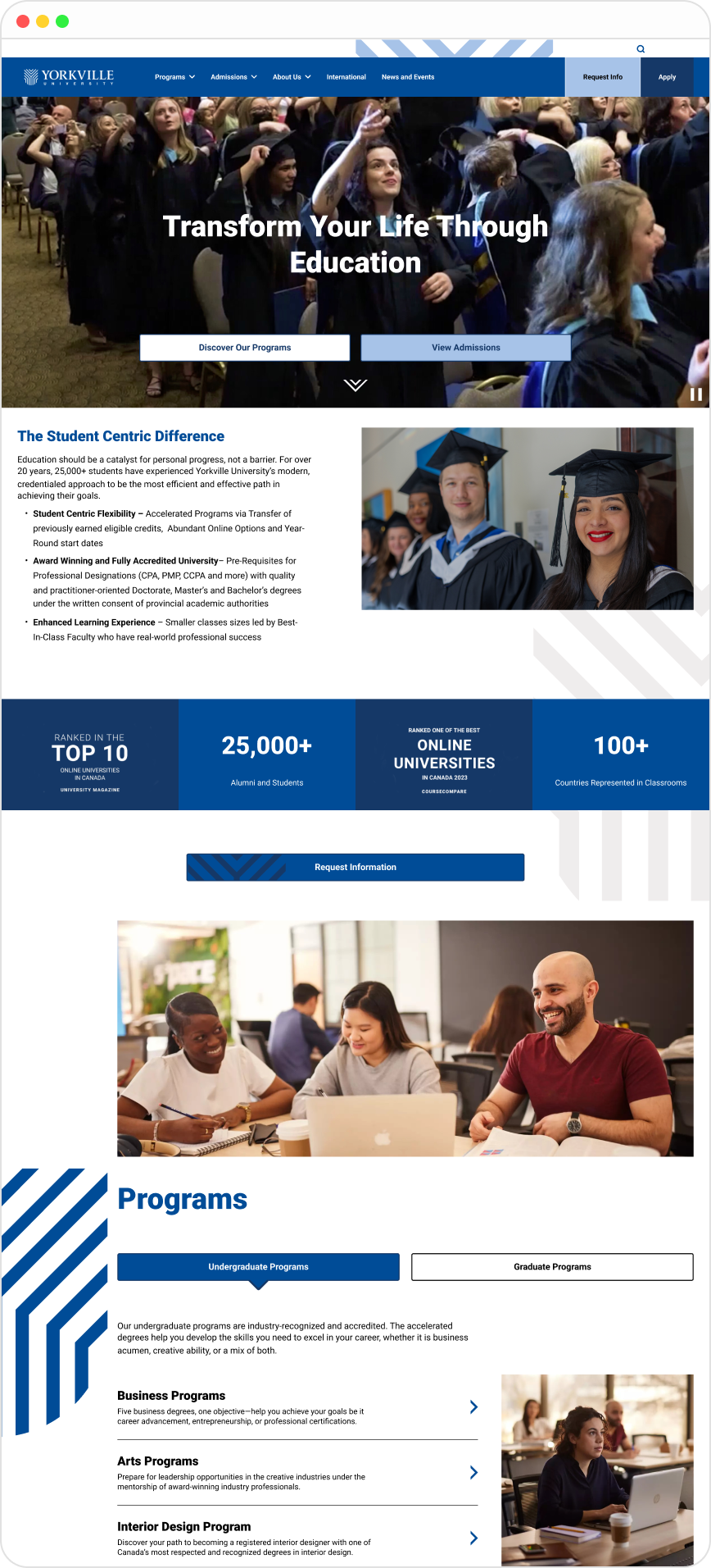
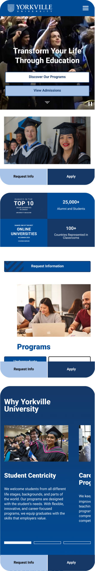
A digital system that tells a story and converts at the same time.
Yorkville's existing website was carrying too much weight without enough structure. A wide range of programs, multiple audience types, and competing pressures between brand storytelling and application conversion, all trying to live on the same pages.
I led art direction end-to-end, holding both UX and visual design across the redesign. The work was building a system that could carry the institution's story without losing the practical paths that turn a visitor into an applicant.
Overview

Website Redesign
Concept, AD, UX, and visual direction
Designing a digital platform that brings brand, content, and user experience into a clear, conversion-focused system.
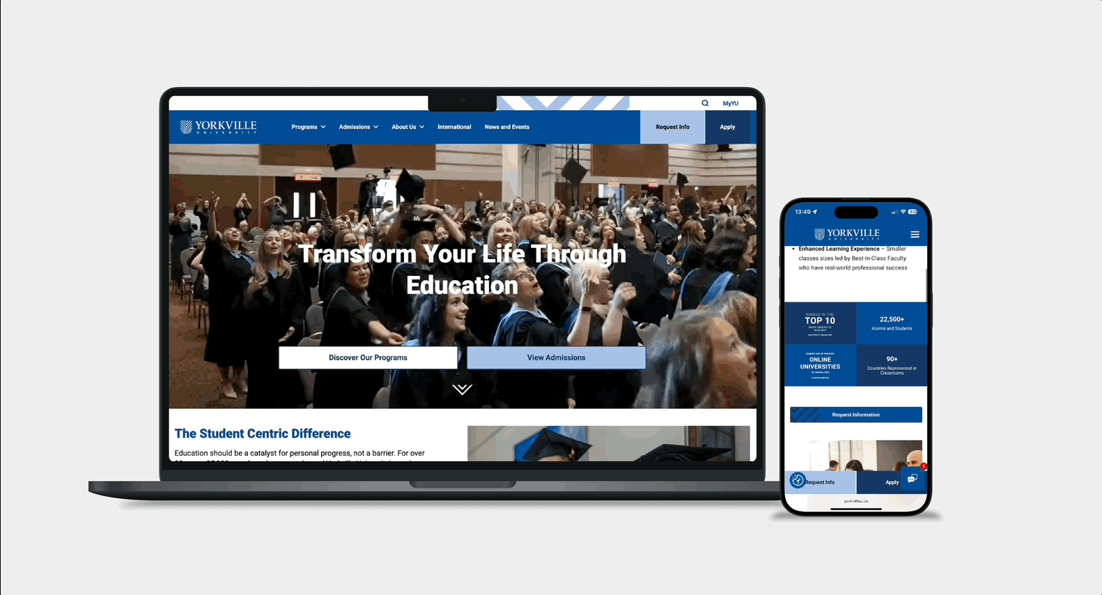
Storytelling and conversion as one system, not a trade-off.
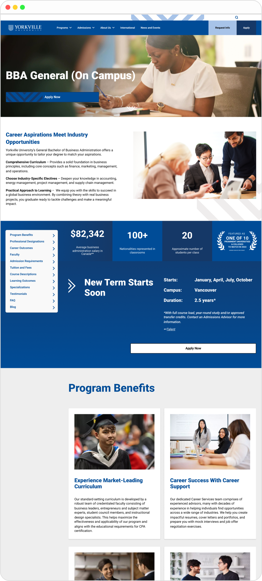
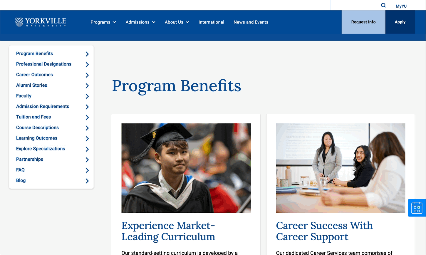
The signature problem of any university website is that brand and function pull in opposite directions. Tell the institution's story well and the application paths get buried. Surface the application paths cleanly and the brand goes flat. The default outcome on most higher-education sites is one of those two failure modes, sometimes both at once.
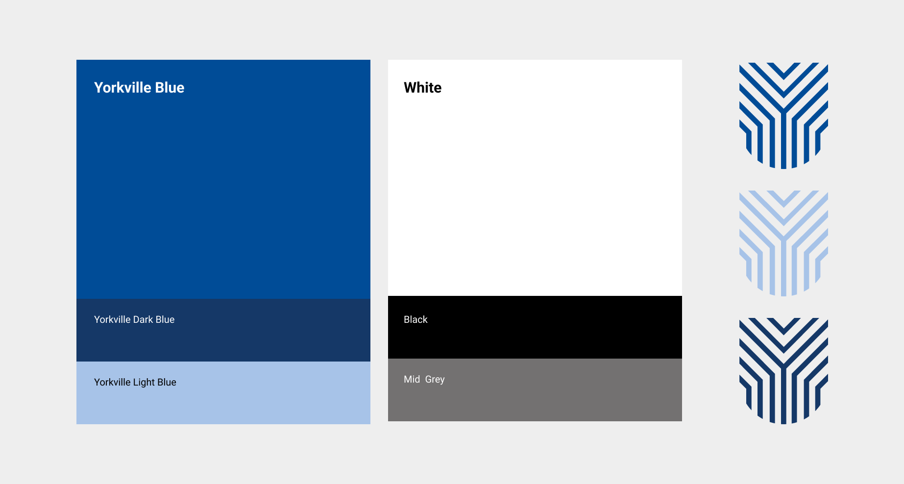
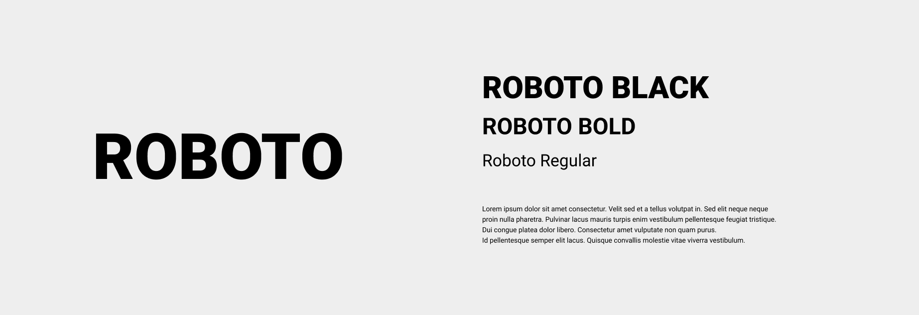
I built the system around the assumption that storytelling and conversion shouldn't compete for the same real estate. They should hand off to each other. Each page type was designed with a clear job, emotional weight here, decision-support there and the visual system was built to let users know which mode they were in without having to think about it. Typography, color, hierarchy, and component logic all carried that distinction.
Holding both UX and visual direction meant the structural calls and the expressive calls could be made at the same table. The grid, the components, the responsive behaviour, and the visual language were all designed together rather than as a relay race between disciplines. The system scales across programs, content types, and audience journeys without breaking.
Role: Art Director on UX and UI. Concept, IA contribution, component system, visual language, responsive behaviour. End-to-end ownership of the digital art direction.

Next Project: