
BCDO
Info

Graphic Design — Art Direction — Digital — Social Media Concepting
Client — BC Doctors of Optometry
Creative Direction — Graham MacInnes
Art Direction — Michael Lipsett
Copywriter — Jackson Murphy
Producer — Neil Chin
Agency — Pound & Grain
British Columbia Doctors of Optometry. Pound & Grain, 2025–2026. Art Director
Two campaigns for one mandate: get British Columbians to take their eye health seriously.
BCDO had a strong professional reputation and a quieter consumer presence than the work deserved. The brief was to bring awareness to eye health across BC, starting with the audiences most likely to put off booking an exam.
I led art direction across both campaigns. A 2025 traditional and digital awareness push aimed at parents, and a 2026 always-on social campaign aimed at adults. Two distinct concepts. One brand finding its voice.
Overview
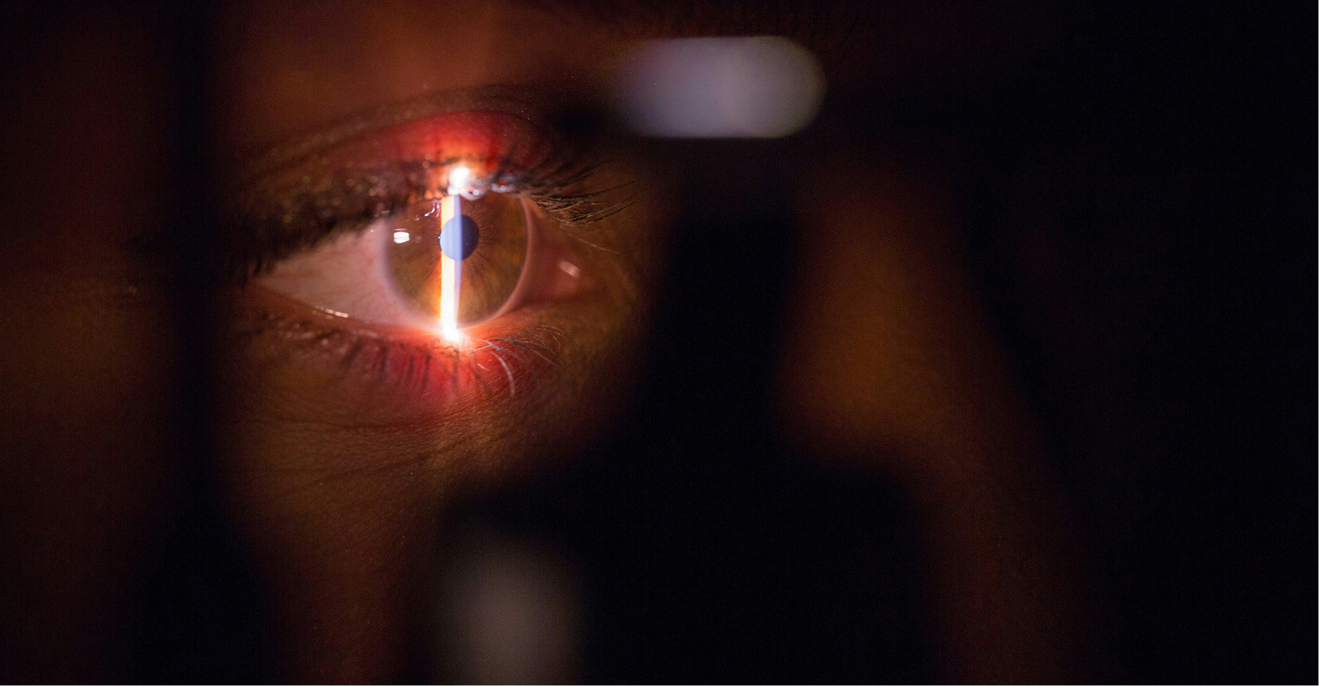
Let’s get clear 2025 Awareness Campaign
Art Direction and concept origination
Vision problems are kinda sneaky. Let’s get clear brings awareness to parents and their child’s eye health.
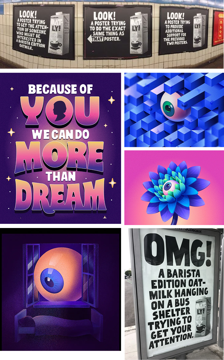
MOODBOARD INSPIRATION
CREATIVE MOCK-UPS
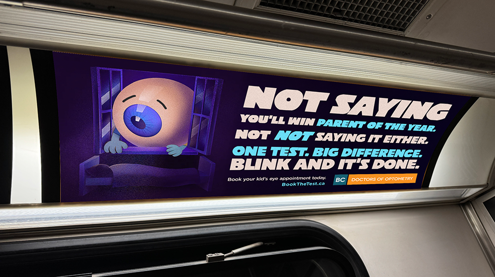
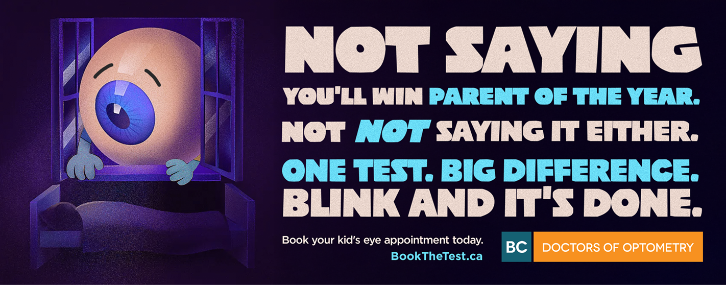
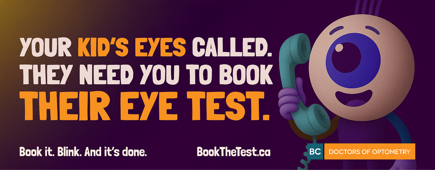
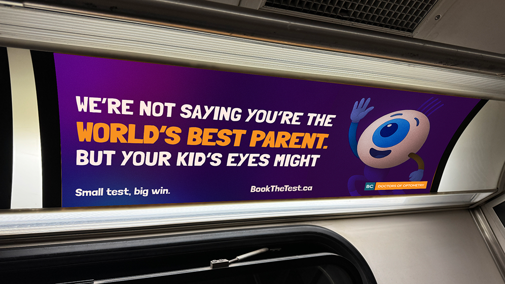
Positioning kids' eye exams as the badge of smart parenting.
Parents in BC often assume school vision screenings are enough. They aren't. The depth and care a Doctor of Optometry provides is a different category of exam, and most parents juggling back-to-school chaos never get that information at the moment they need it.
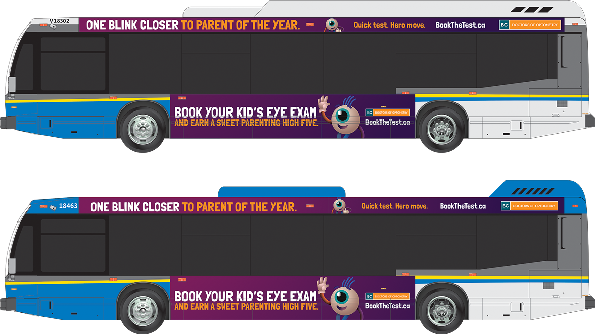
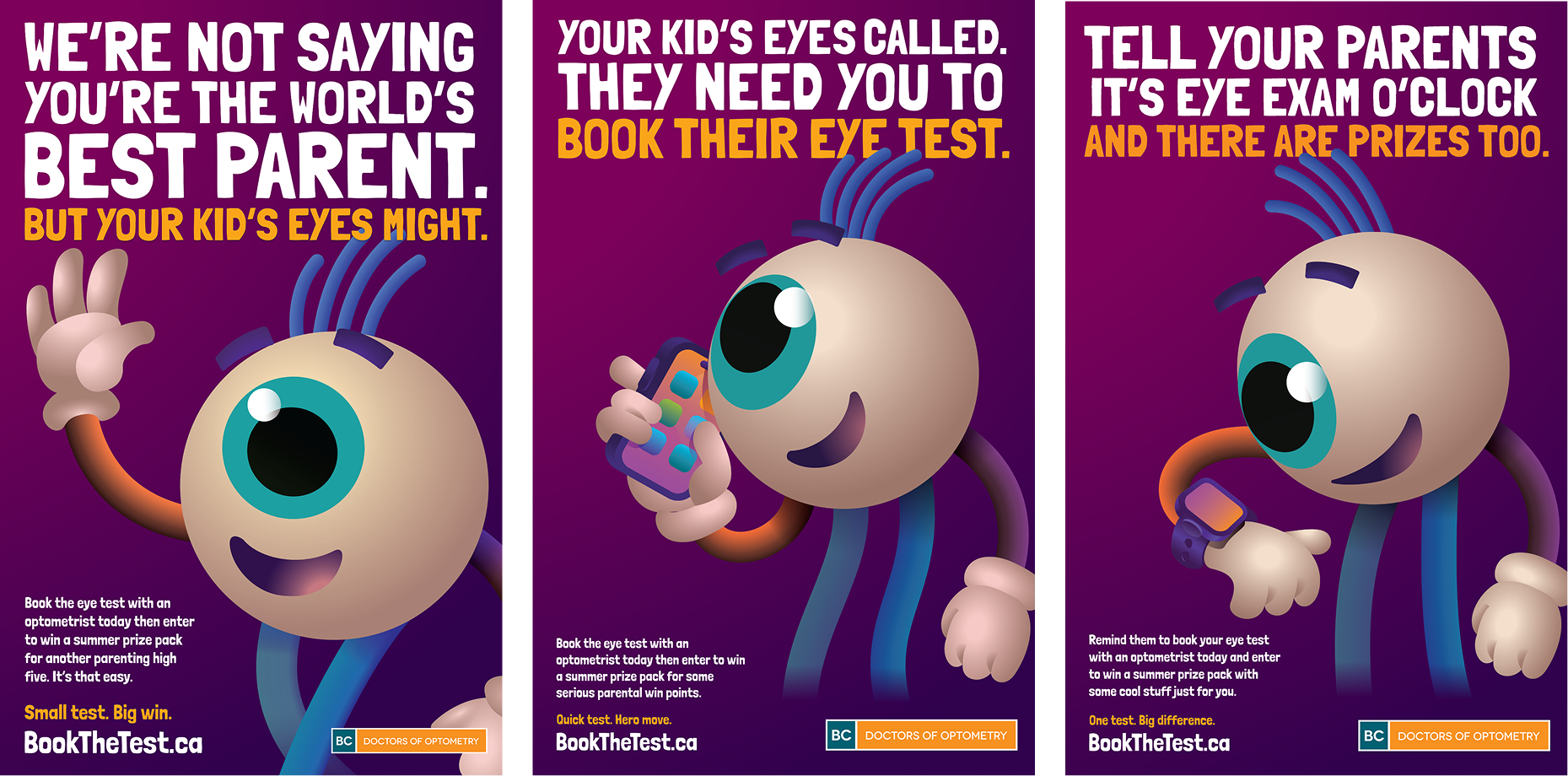
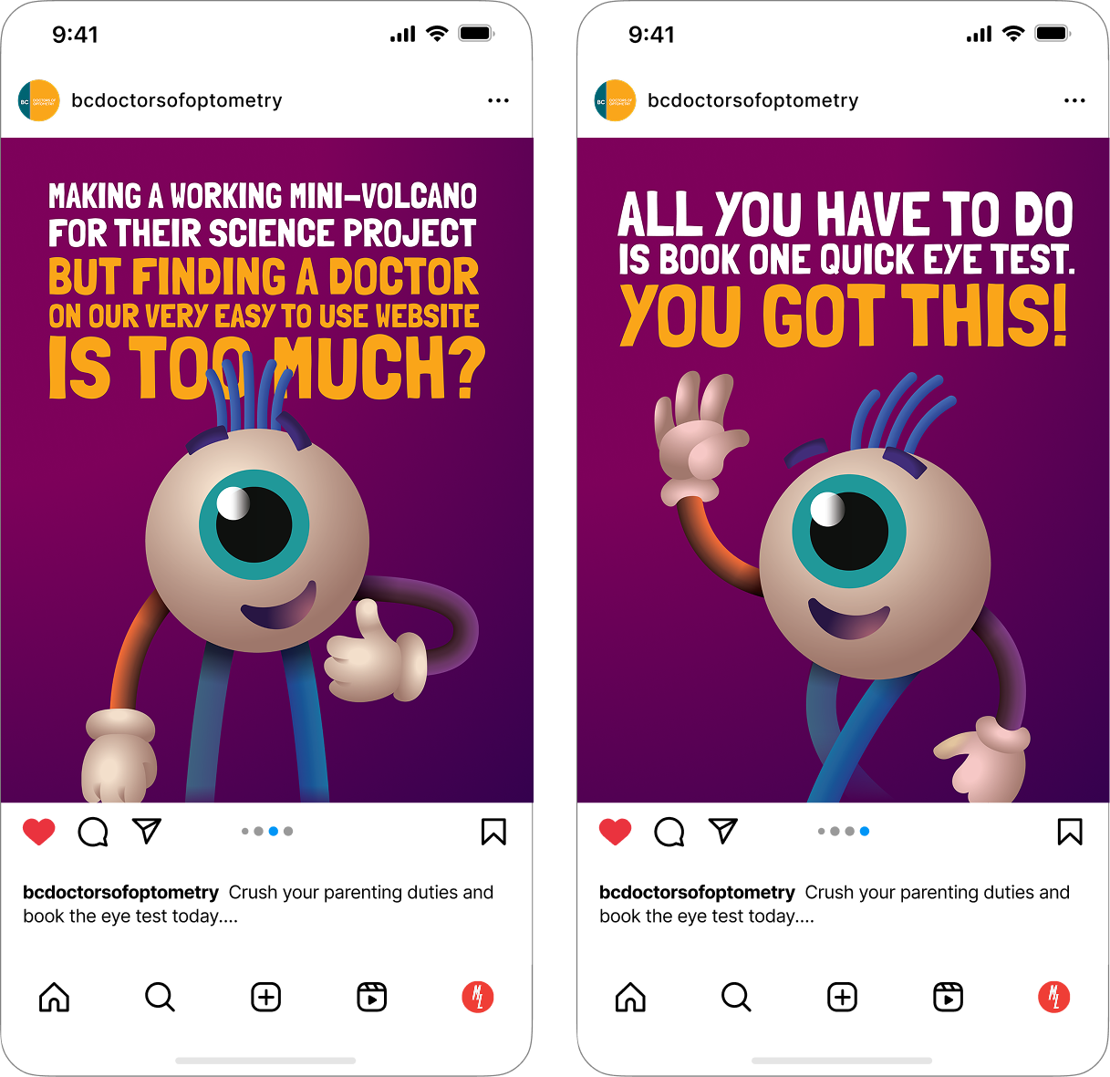
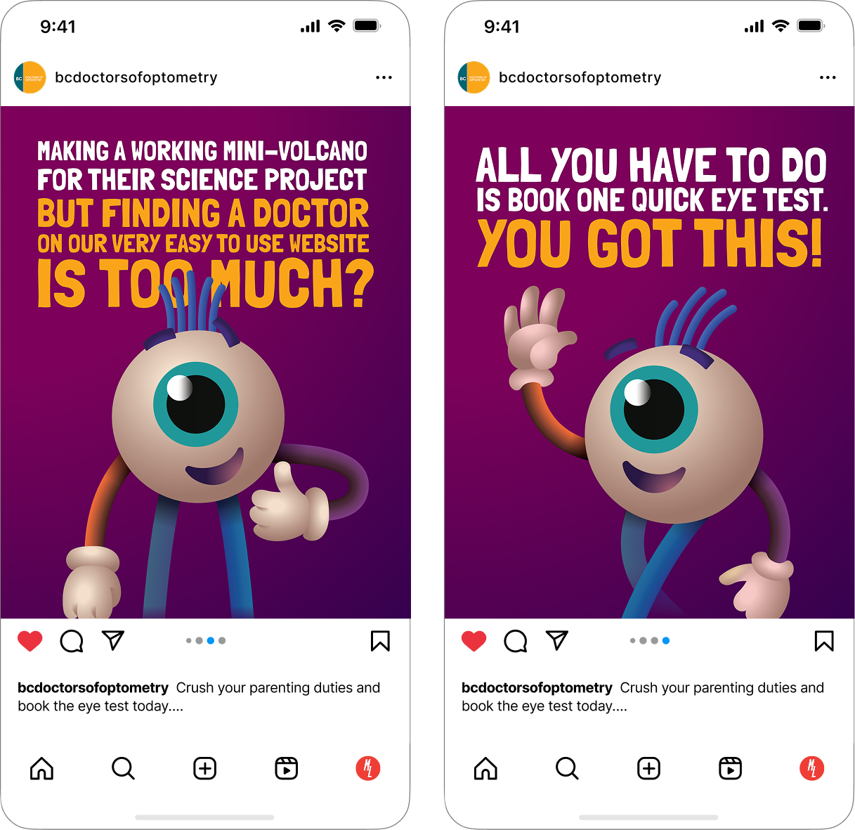
The concept was mine. I proposed positioning kids' eye exams as the smart, simple thing parents do — the move ahead of the problem, not in response to one. Strategy and the CD refined the angle, and we built the campaign on it. A bold, eye-catching visual system designed to stop parents in their tracks on the bus, in SkyTrain stations, and in the social feed.
The work ran across transit, posters, digital out-of-home, and paid social, targeting parents in the back-to-school window.
Role: Originated the campaign concept. Led art direction across all media. Transit, posters, DOOH, and social.
FINAL CREATIVE



2026 Always on Creative
Art Direction and concept
"We Speak Eyeball" is a simple, slightly
absurd claim that cuts through the noise.
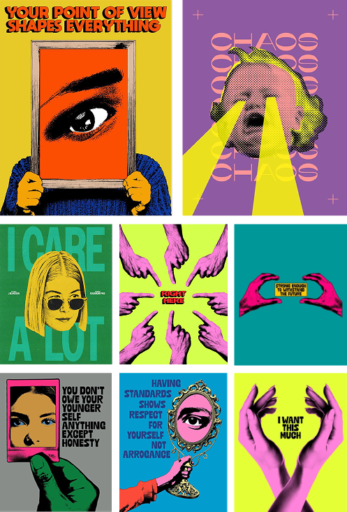
MOODBOARD INSPIRATION
CREATIVE MOCK-UPS
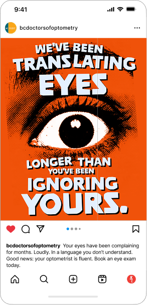
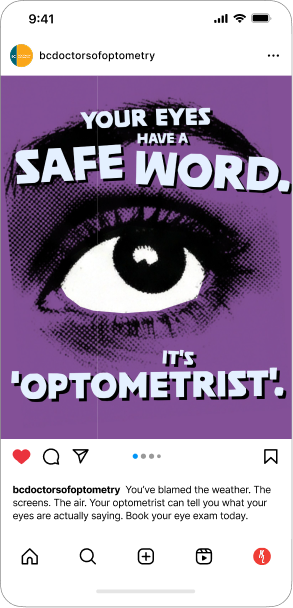
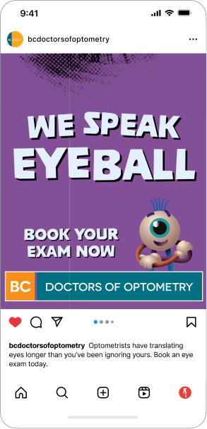
A simple, slightly absurd claim that cuts through the noise.
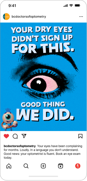
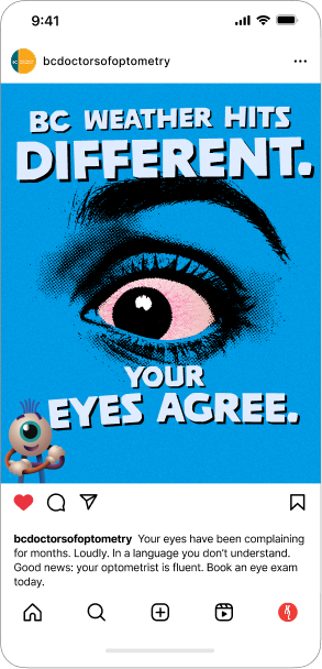
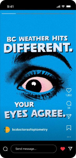
Where the parent campaign needed to stop people in their tracks, the always-on social work needed to live in the feed and earn the scroll-stop on its own terms. I wanted the work to feel slightly unsettling. Leaning into a horror-adjacent visual language, with bright colours and punchy copy doing the work of cutting through.
The first wave targeted adults 30–40, the demographic most likely to skip annual exams because nothing feels obviously wrong. The campaign's tension is that nothing feeling wrong is exactly when the problems start, and your eye doctor is the one who can see them coming.
The visual system was built to flex across multiple directions while keeping the same off-kilter tone, so the campaign could stay surprising as it rolled out.
Role: Concept and art direction. Built the visual system, directed the rollout, and designed key assets.
Direction 1
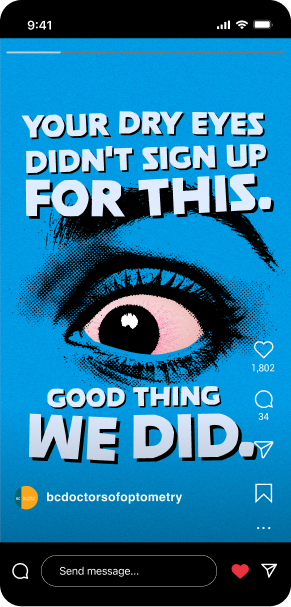
Direction 2
Next Project: